- Beranda
- Komunitas
- Entertainment
- Lounge Pictures
Mantappp!!!! London Olympic Games 27 July - 12 August 2012
TS
susuputihmanis
Mantappp!!!! London Olympic Games 27 July - 12 August 2012
Bagi agan-agan yang ingin mengetahui persiapan dan rencana Olympic 2012 di London serta elemen pendukung nya silakan di simak, maaf ane share dalam bahasa inggris, karena sesuai sumbernya  . Semoga berkenan
Here we look at some of the designs that will help form 'the look' of the 2012 games.
the overall look of the 2012 games has been overseen by mccann worldgroup
in collaboration with londons organizing committee. over the past 3 years they've collaborated
with several designers, architects, advertisers, sponsors and others to implement an impressive
visual identity that will be seen across the world for much of the next month.
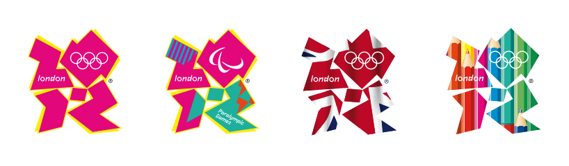
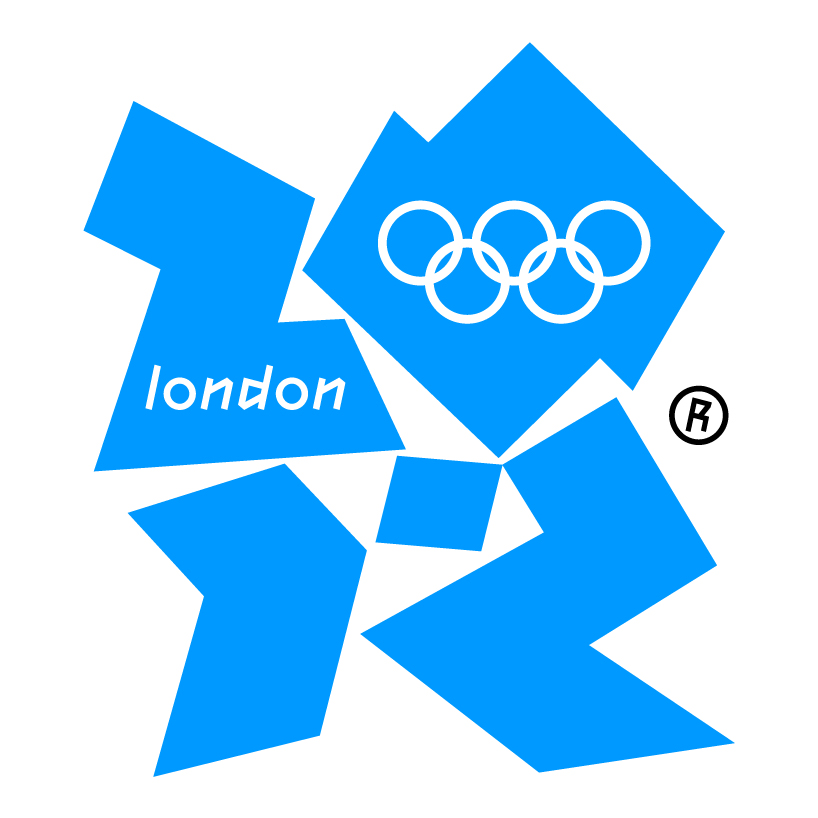
logo by wolff olins
the logo needs little introduction, love it or hate it, you certainly recognize it.
designed by wolff olins in 2007 the logo aimed to attract the attention of a young audience
and enthuse them about the games imminent arrival to the british capital.
wolff olins worked with londons organizing committee (LOCOG ) to define
a clear ambition for london 2012. these games were to be everyones.
they would call on people to challenge themselves to try new things, to go
further, to discover new abilities. the brand we created supports this ambition.
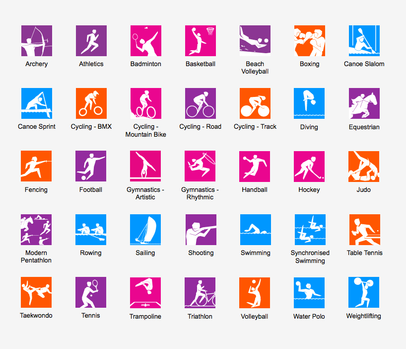
pictograms
38 olympic pictograms designed by someone will be used on merchandise, signs and tickets,
environmental graphics and signage - helping spectators find their way to their sport of choice
when the olympics begin.
pictograms of each sport were first used at the 1948 games in london and have become a regular
feature of the olympic movement since the tokyo games in 1964. otl aicher's pictograms for the
1972 olympics in munich are largely regarded as the design benchmark.
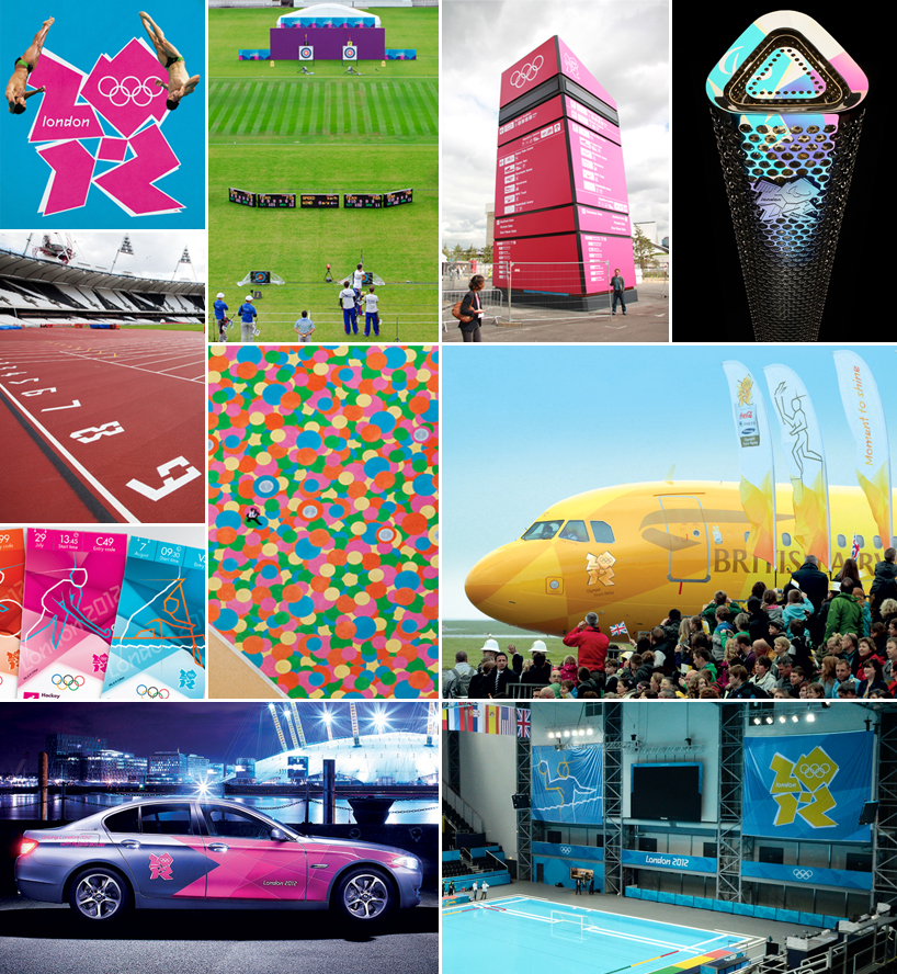
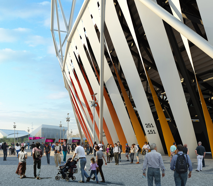
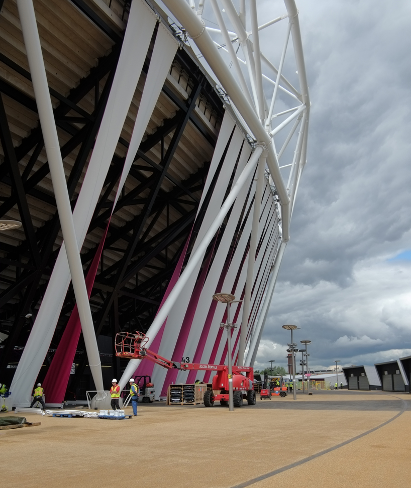
stadium wrap by sophie smallhorn
the wrap by sophie smallhorn is formed from canvas banners that run from the top to the bottom of the stadiums exterior,
creating 300 slit-like entrances. each banner is assigned a different colour from a palette of 56 colours in total to create an undulating effect.
wayfinding signage by surface architects
surface architects were appointed to work with LOCOG and ISG in the design and delivery
of a family of high profile wayfinding structures for the 2012 olympic park. the proposals combine
historic vectors and iconic influences into a highly distinctive design that fits LOCOGs original
look and feel brief. TFL's johnston typeface is used on the signage in addition to the 2012 typeface.
'each form incorporates LED backlighting, creating a field of glowing beacons
across the stratford park. six 7m high zone beacons, five 15m high major beacons and two 12m high
entrance gantries are currently being constructed. all are designed from sustainably sourced fabrics
and will be dismantled, recycled and reused post games.'
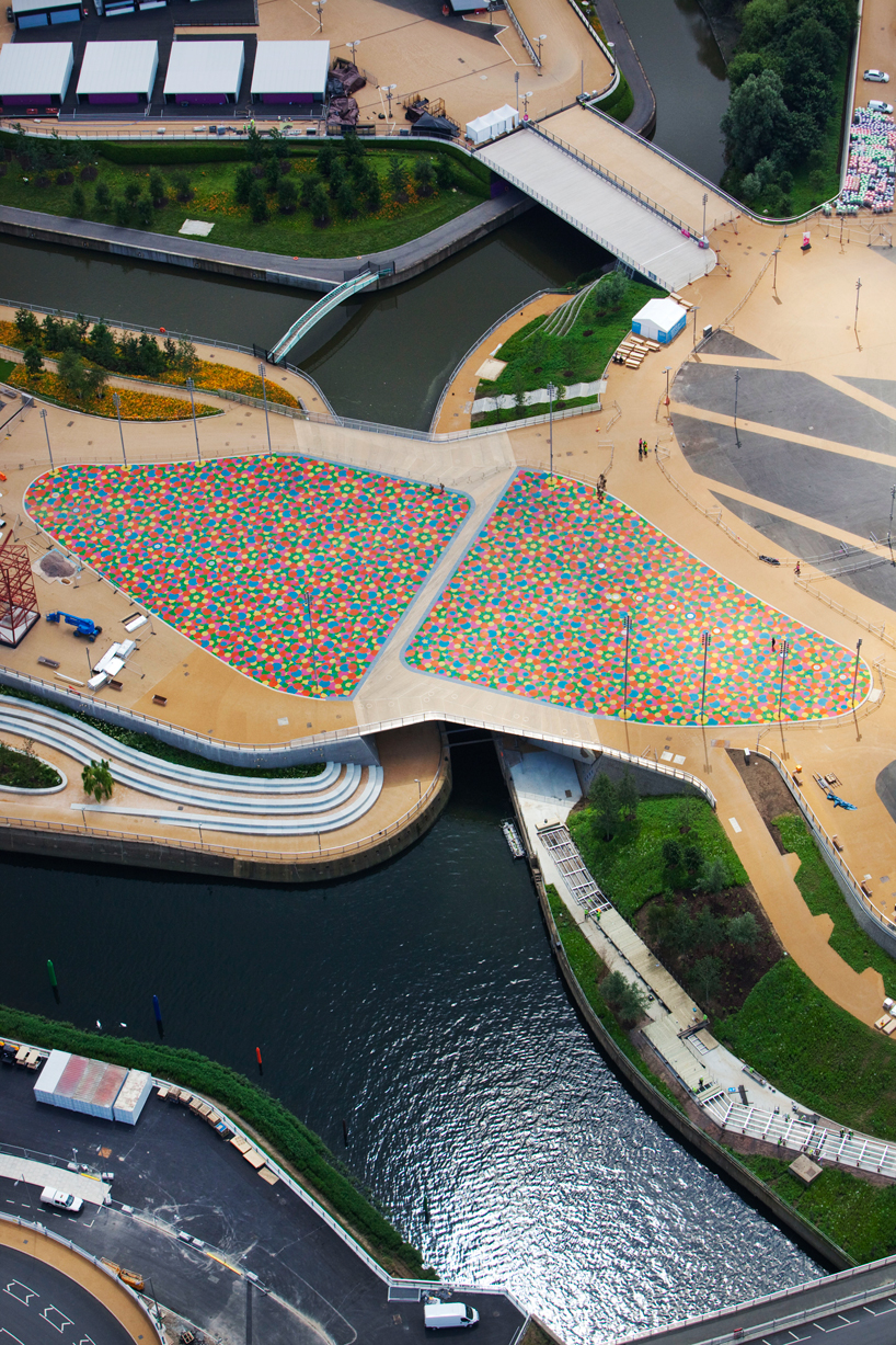
central park bridge by heneghan peng architects
while heneghan peng architect's central park bridge falls under the olympics architectural program
we have included it here because of its graphic nature, for sure this will be a favorite of broadcasters
and photographers.
the central park footbridge spans over the river lea at a focal point between the olympic stadium and aquatics centre, and features both permanent and temporary elements to integrate games and legacy use.

. Semoga berkenanQuote:
Here we look at some of the designs that will help form 'the look' of the 2012 games.
the overall look of the 2012 games has been overseen by mccann worldgroup
in collaboration with londons organizing committee. over the past 3 years they've collaborated
with several designers, architects, advertisers, sponsors and others to implement an impressive
visual identity that will be seen across the world for much of the next month.
Spoiler for variations of the 2012 london olympics logo by wolffolins:
Spoiler for 2012 london olympics logo by wolffolins:
logo by wolff olins
the logo needs little introduction, love it or hate it, you certainly recognize it.
designed by wolff olins in 2007 the logo aimed to attract the attention of a young audience
and enthuse them about the games imminent arrival to the british capital.
wolff olins worked with londons organizing committee (LOCOG ) to define
a clear ambition for london 2012. these games were to be everyones.
they would call on people to challenge themselves to try new things, to go
further, to discover new abilities. the brand we created supports this ambition.
Quote:
pictograms
38 olympic pictograms designed by someone will be used on merchandise, signs and tickets,
environmental graphics and signage - helping spectators find their way to their sport of choice
when the olympics begin.
pictograms of each sport were first used at the 1948 games in london and have become a regular
feature of the olympic movement since the tokyo games in 1964. otl aicher's pictograms for the
1972 olympics in munich are largely regarded as the design benchmark.
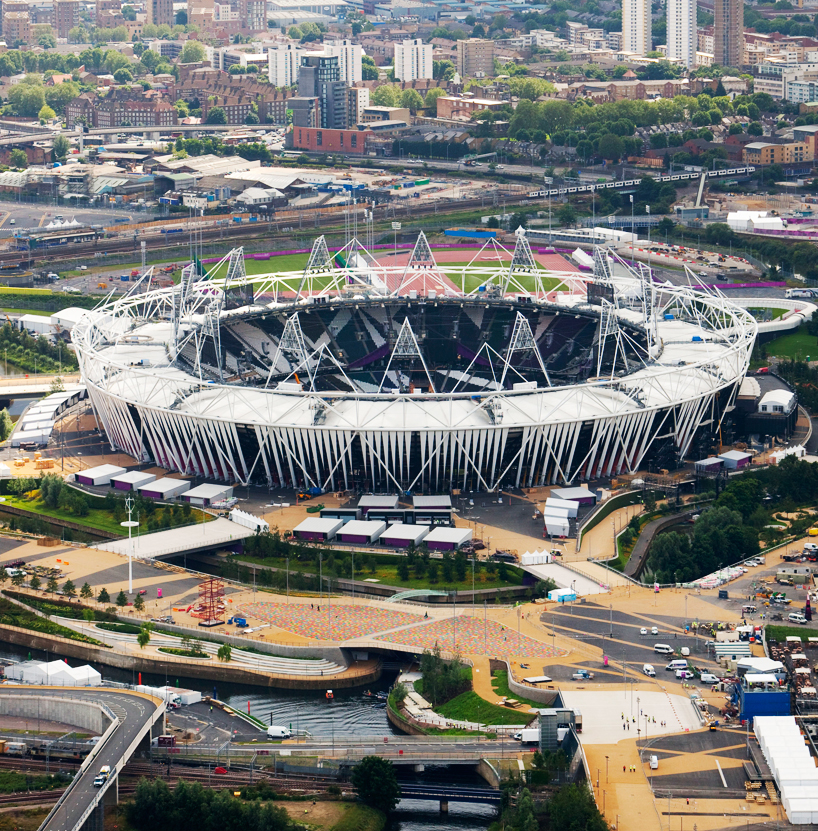
Spoiler for foto:
Quote:
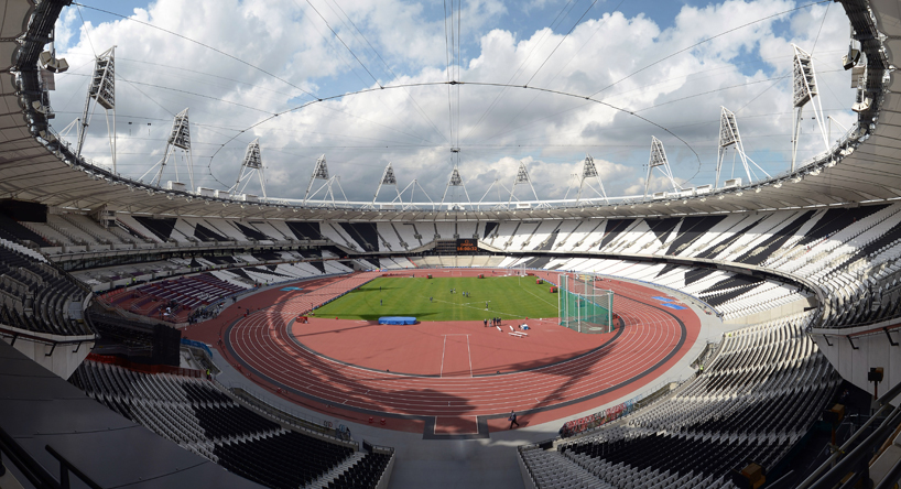
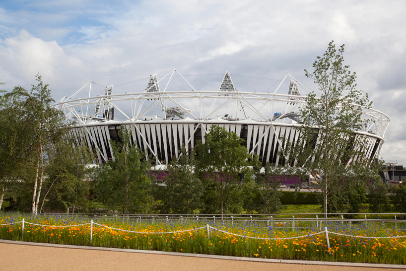
Spoiler for olympic stadium seating:
Spoiler for seating and staidum wrap at the olympic stadium:
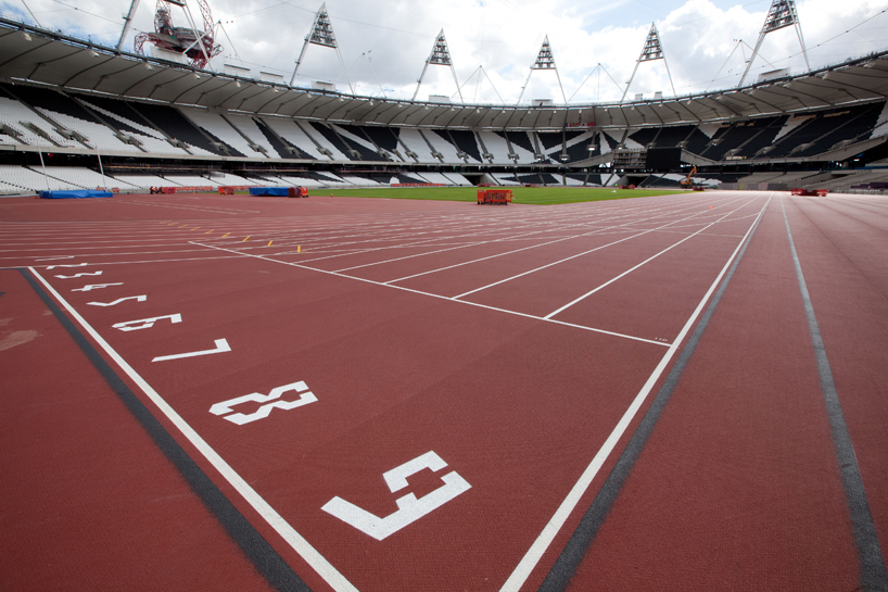
Spoiler for track numbers set in the 2012 typeface designed by alias:
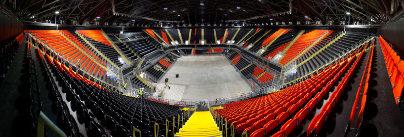
Spoiler for basket ball arena stadium seating:
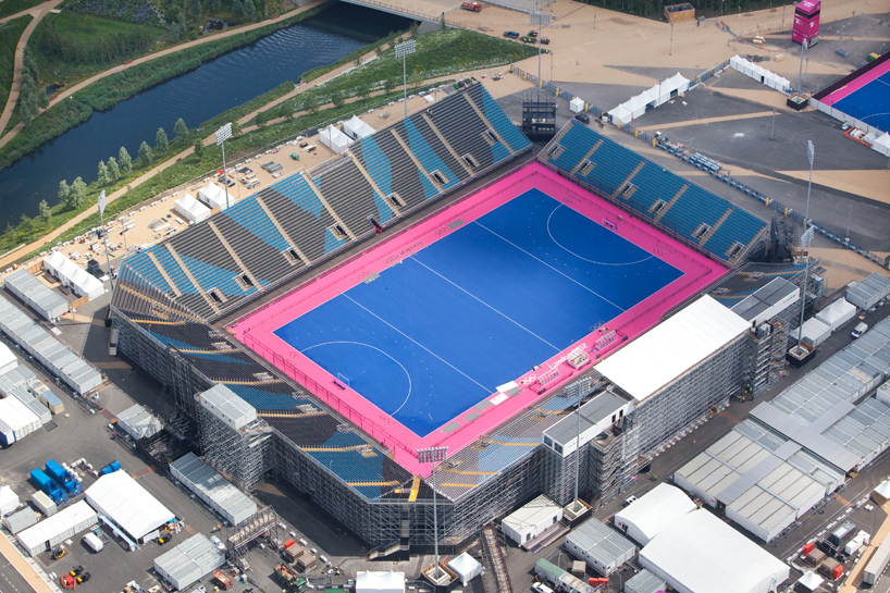
Spoiler for hockey stadium seating:
Spoiler for ground view of stadium wrap by sophie smallhorn:
Quote:
stadium wrap by sophie smallhorn
the wrap by sophie smallhorn is formed from canvas banners that run from the top to the bottom of the stadiums exterior,
creating 300 slit-like entrances. each banner is assigned a different colour from a palette of 56 colours in total to create an undulating effect.
Spoiler for stadium wrap by sophie smallhorn:
Spoiler for stadium wrap by sophie smallhorn:
Quote:
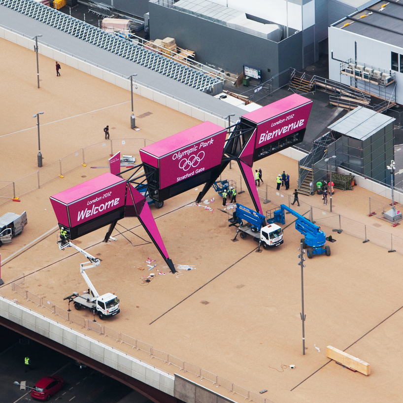
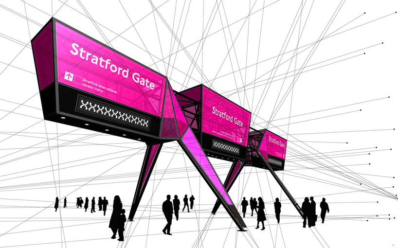
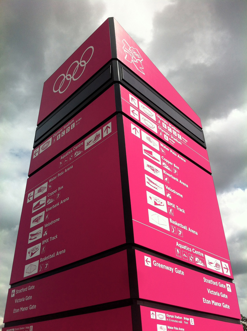
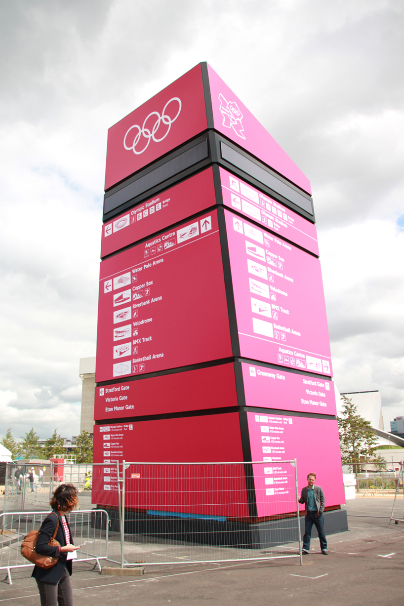
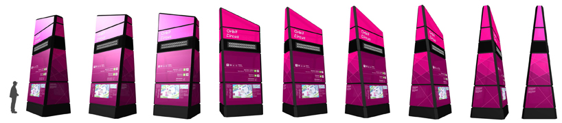
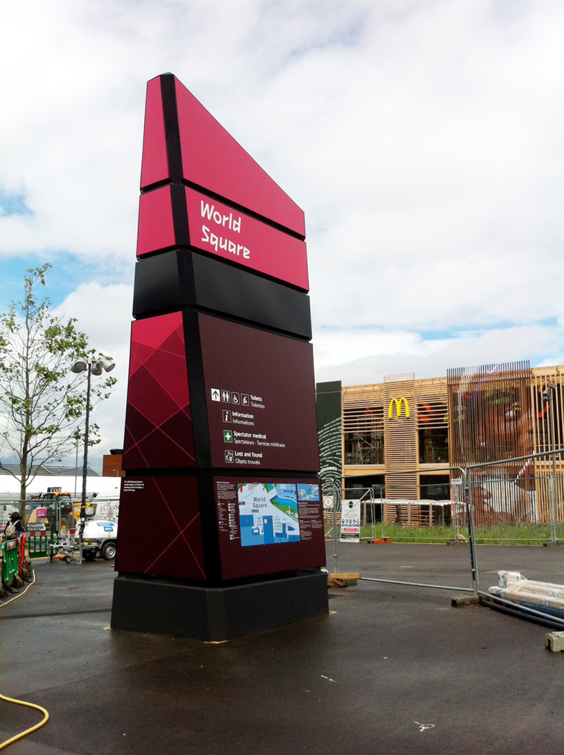
wayfinding signage by surface architects
surface architects were appointed to work with LOCOG and ISG in the design and delivery
of a family of high profile wayfinding structures for the 2012 olympic park. the proposals combine
historic vectors and iconic influences into a highly distinctive design that fits LOCOGs original
look and feel brief. TFL's johnston typeface is used on the signage in addition to the 2012 typeface.
'each form incorporates LED backlighting, creating a field of glowing beacons
across the stratford park. six 7m high zone beacons, five 15m high major beacons and two 12m high
entrance gantries are currently being constructed. all are designed from sustainably sourced fabrics
and will be dismantled, recycled and reused post games.'
Spoiler for entrance gantry being contsructed at the olympic stadium:
Spoiler for signage diagram:
Spoiler for wayfinding beacon by surface architects:
Spoiler for wayfinding beacon by surface architects:
Spoiler for 360 view of one of the smaller the signage beacons
:
Spoiler for wayfinding beacon by surface architects:
Spoiler for stratford subway station:
Quote:
Spoiler for central park bridge by heneghan peng architects:
central park bridge by heneghan peng architects
while heneghan peng architect's central park bridge falls under the olympics architectural program
we have included it here because of its graphic nature, for sure this will be a favorite of broadcasters
and photographers.
the central park footbridge spans over the river lea at a focal point between the olympic stadium and aquatics centre, and features both permanent and temporary elements to integrate games and legacy use.
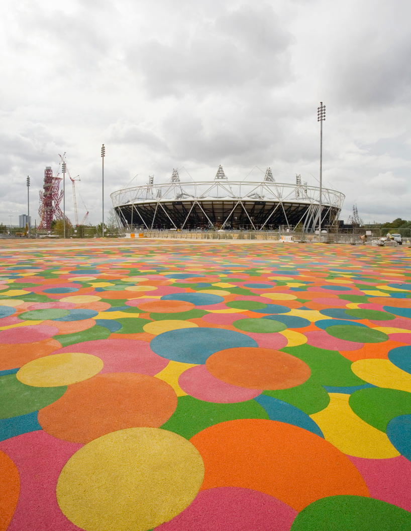
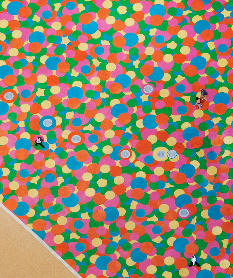
Spoiler for multicolored rubber deck featured:
Spoiler for central park bridge by heneghan peng architects:
Quote:
Arena Olahraga
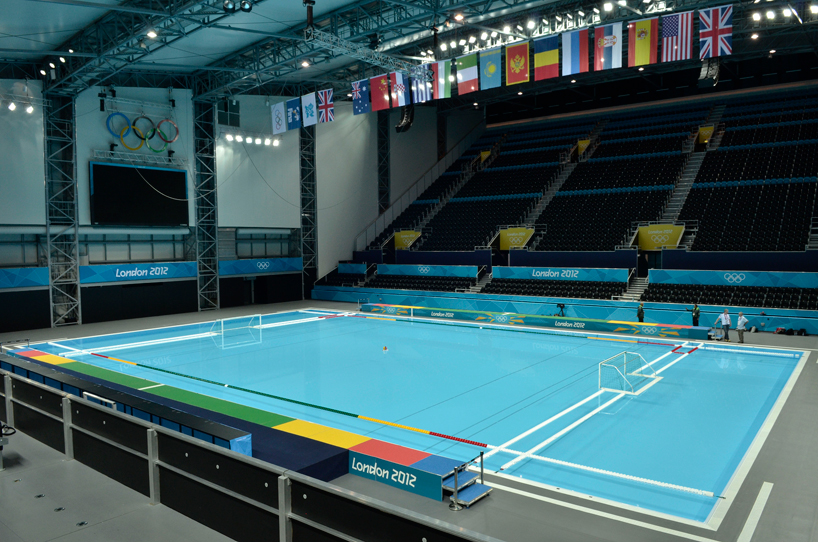
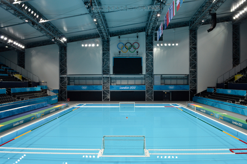
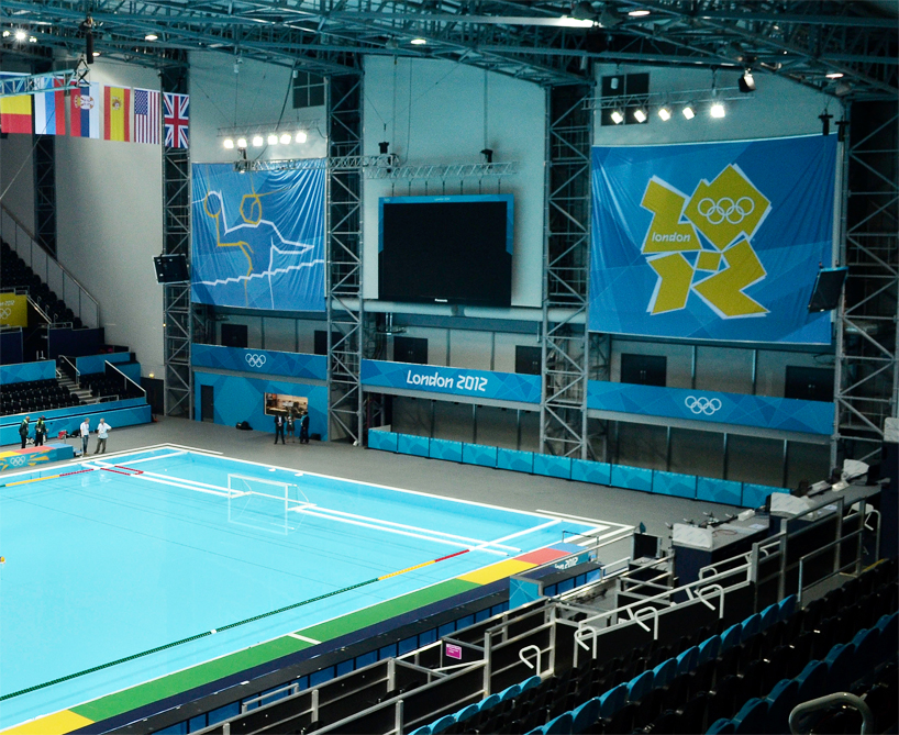
Spoiler for fully dressed water polo venue
-:
Spoiler for fully dressed water polo venue:
Spoiler for fully dressed water polo venue:
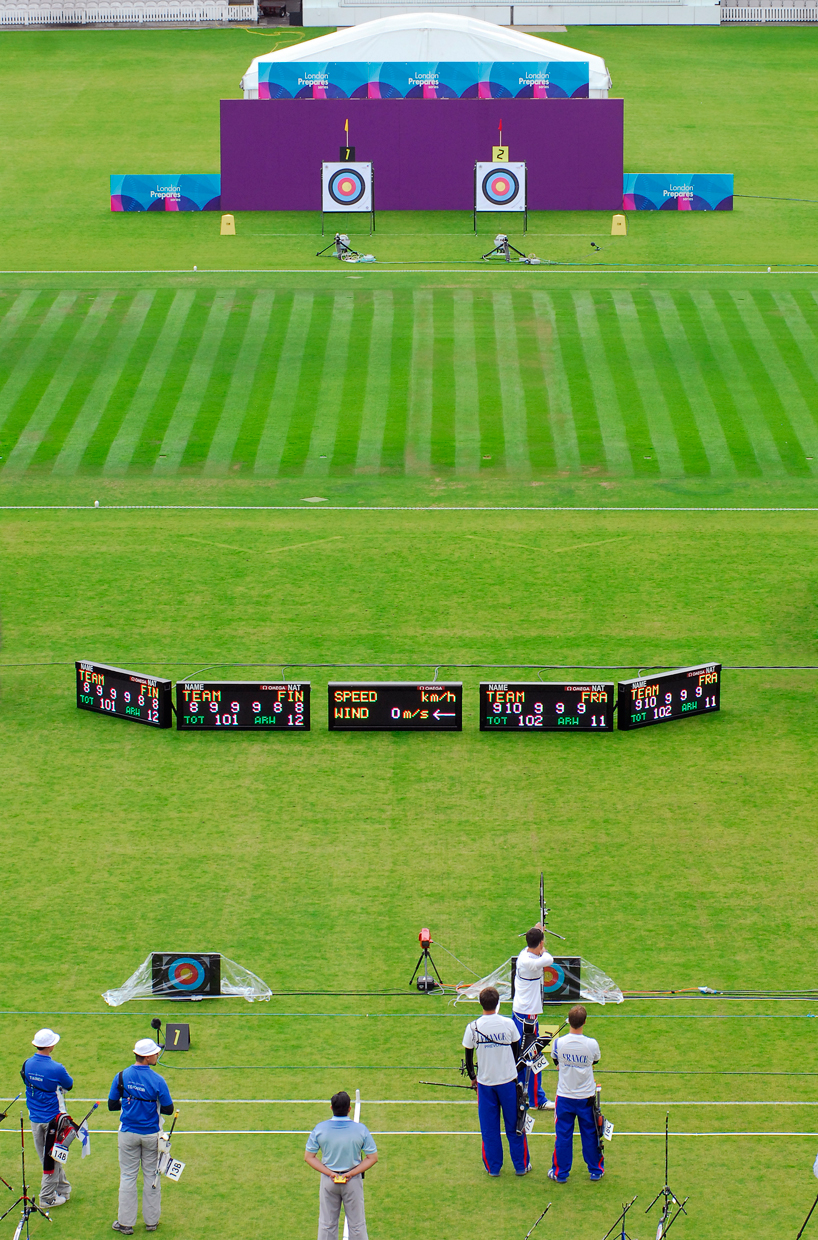
Spoiler for cricket ground will look something like
this:
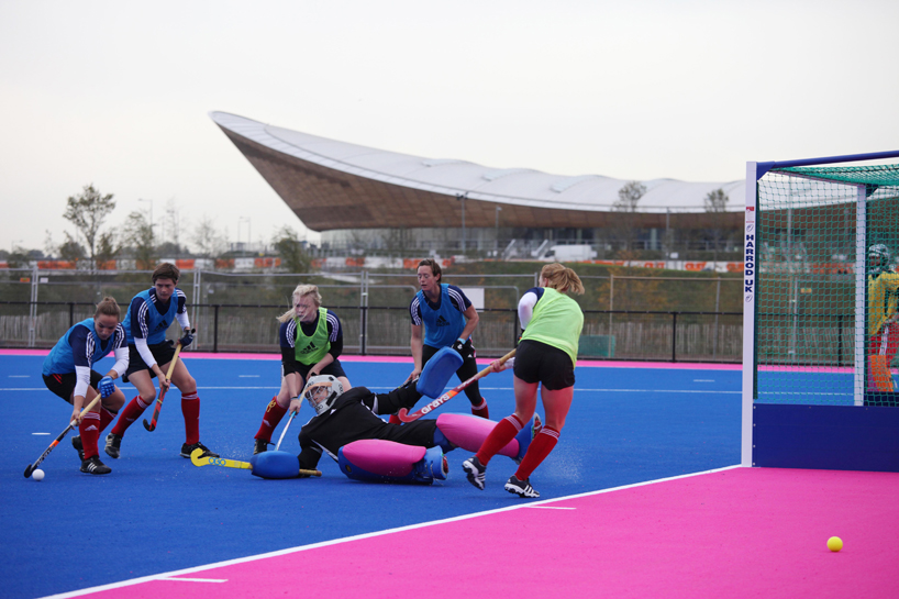
Spoiler for hockey field using the london 2012 brand
colors:
Spoiler for SCHEDULE:
0
5.2K
51

Komentar yang asik ya
Urutan
Terbaru
Terlama
Komentar yang asik ya
Komunitas Pilihan